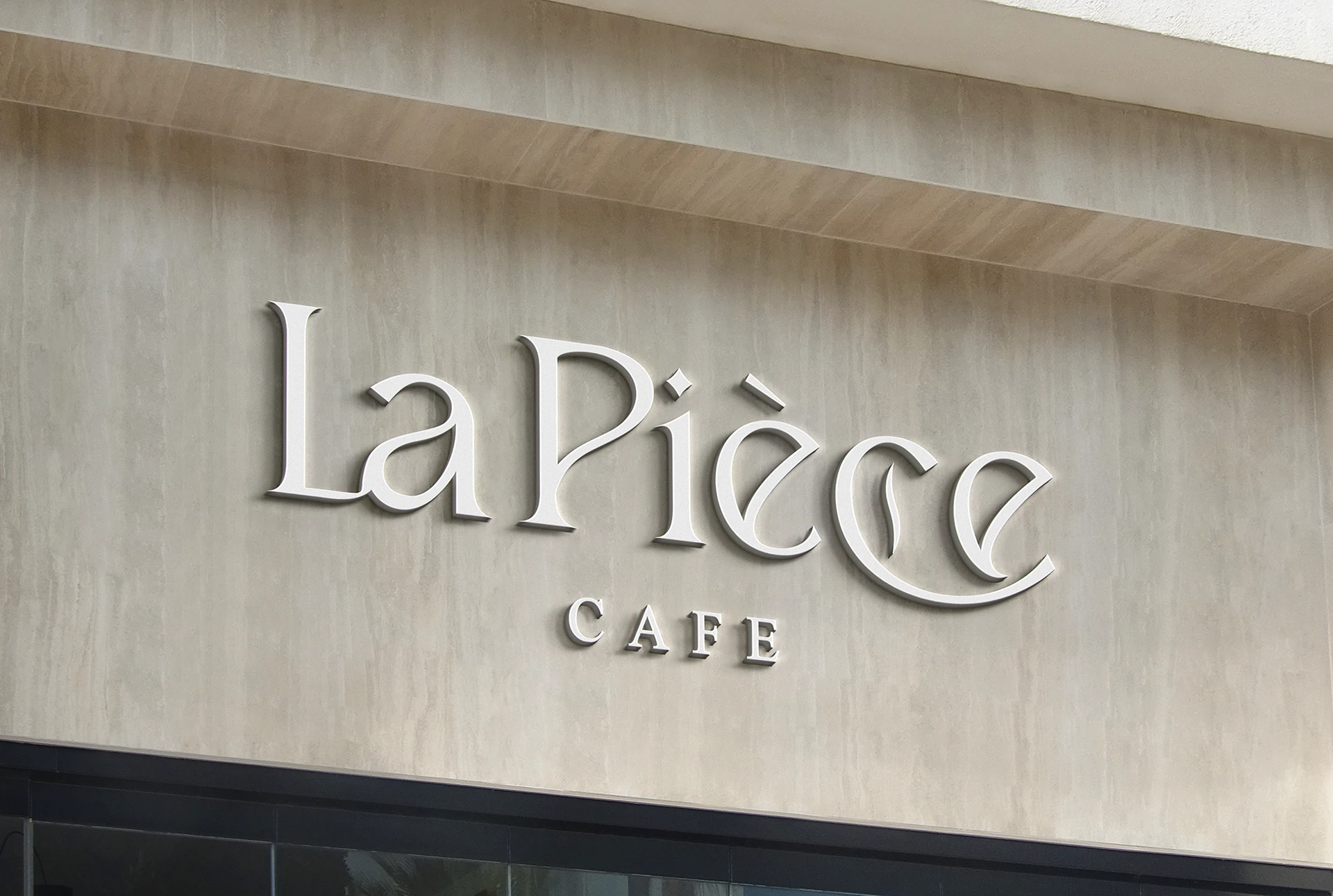
LA PIÈCE CAFÉ is a brand that focuses on providing high-quality coffee and fresh pastries to its customers. The brand targets customers in the upper and middle classes, which suggests that they prioritize quality and a certain level of sophistication in their offerings. The French design in the interior adds to this sense of sophistication and class, and it may also appeal to customers who appreciate classic design elements.
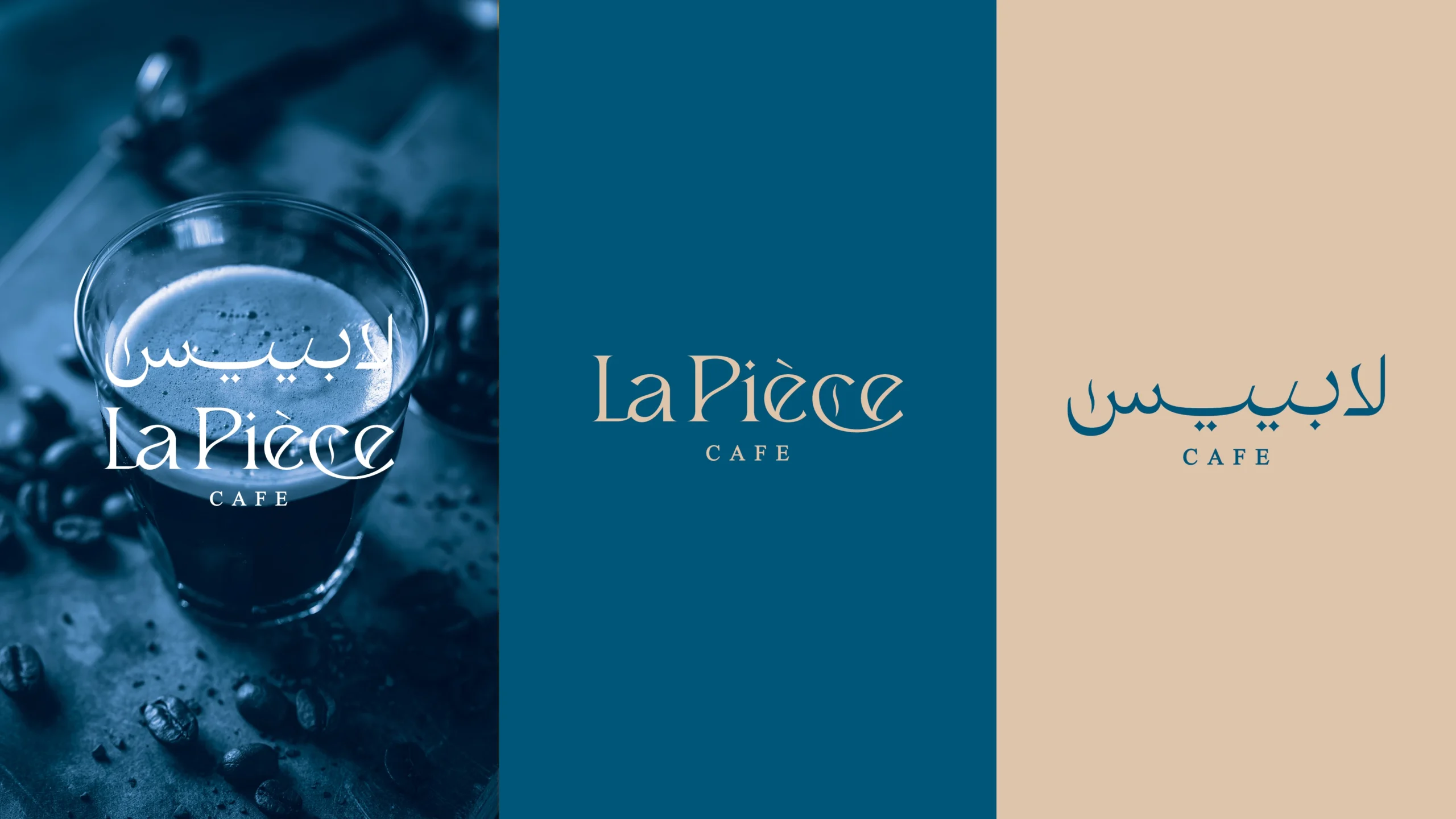
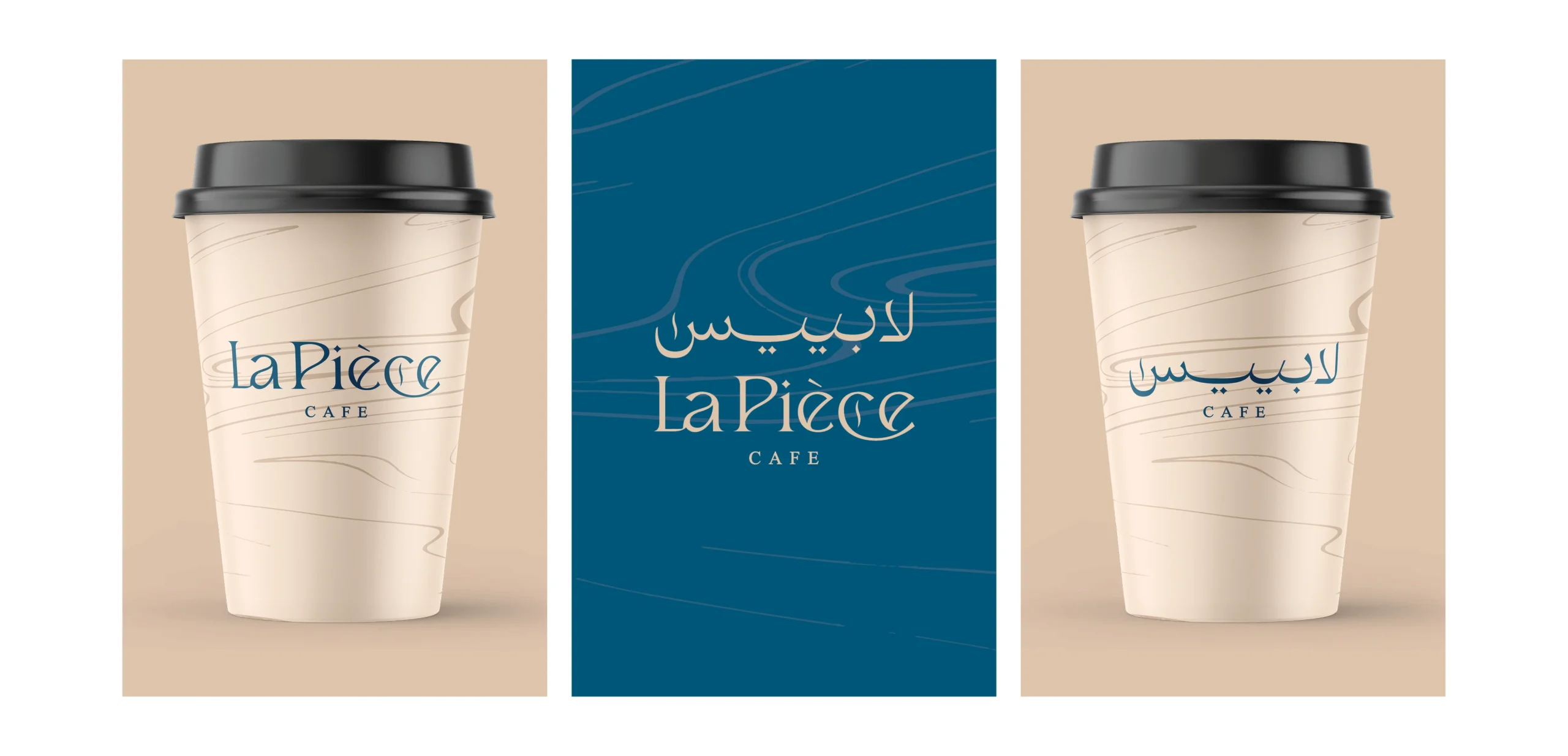
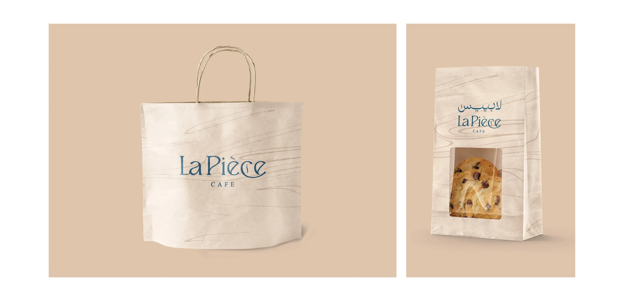
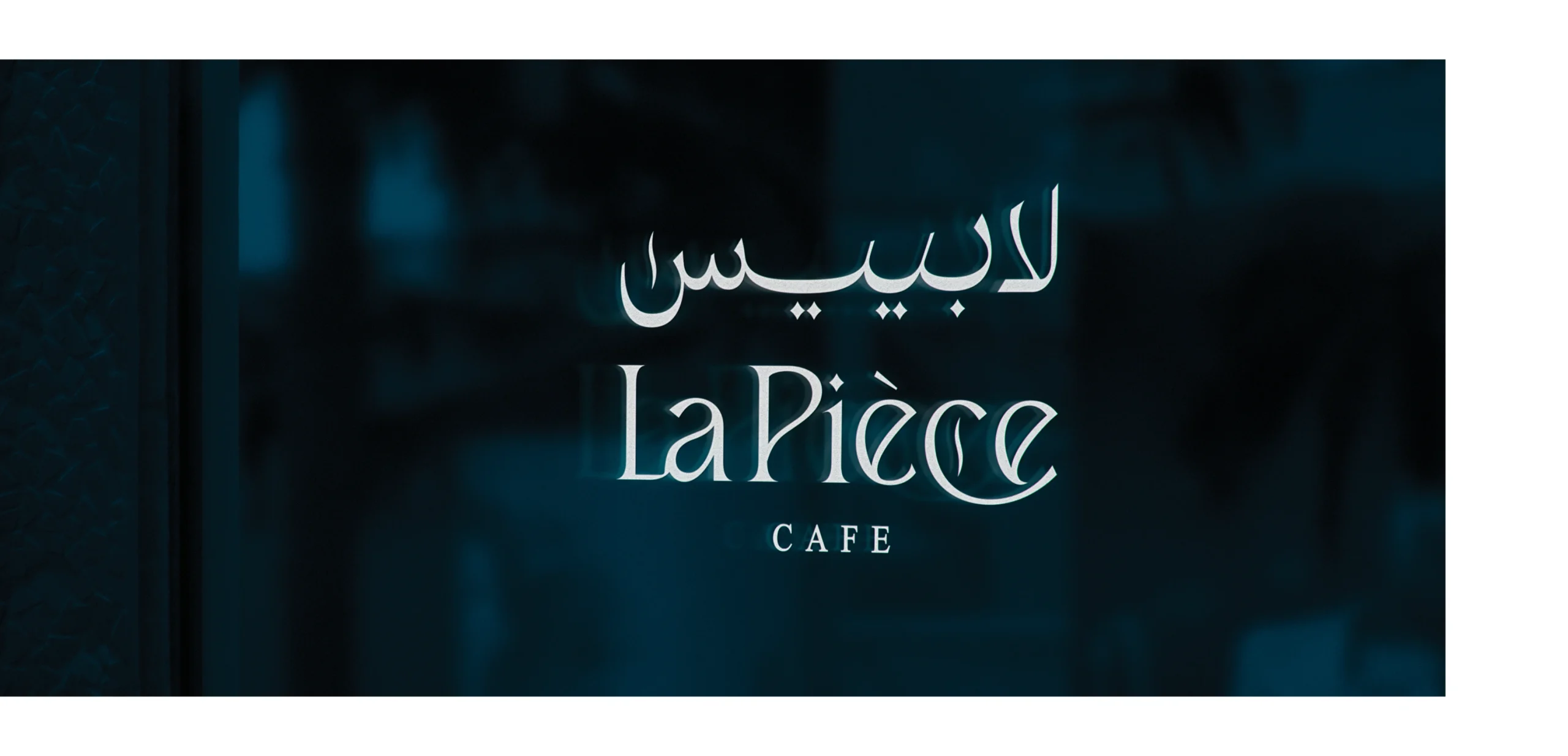
In designing the brand logo, a textual logo style was adopted that relies on the brand name, and this style was used to directly establish the name in the client’s mind. To associate the name with coffee, a smoke symbol that is associated with coffee was added. The font, which was created specifically for the the brand.
Services
Branding
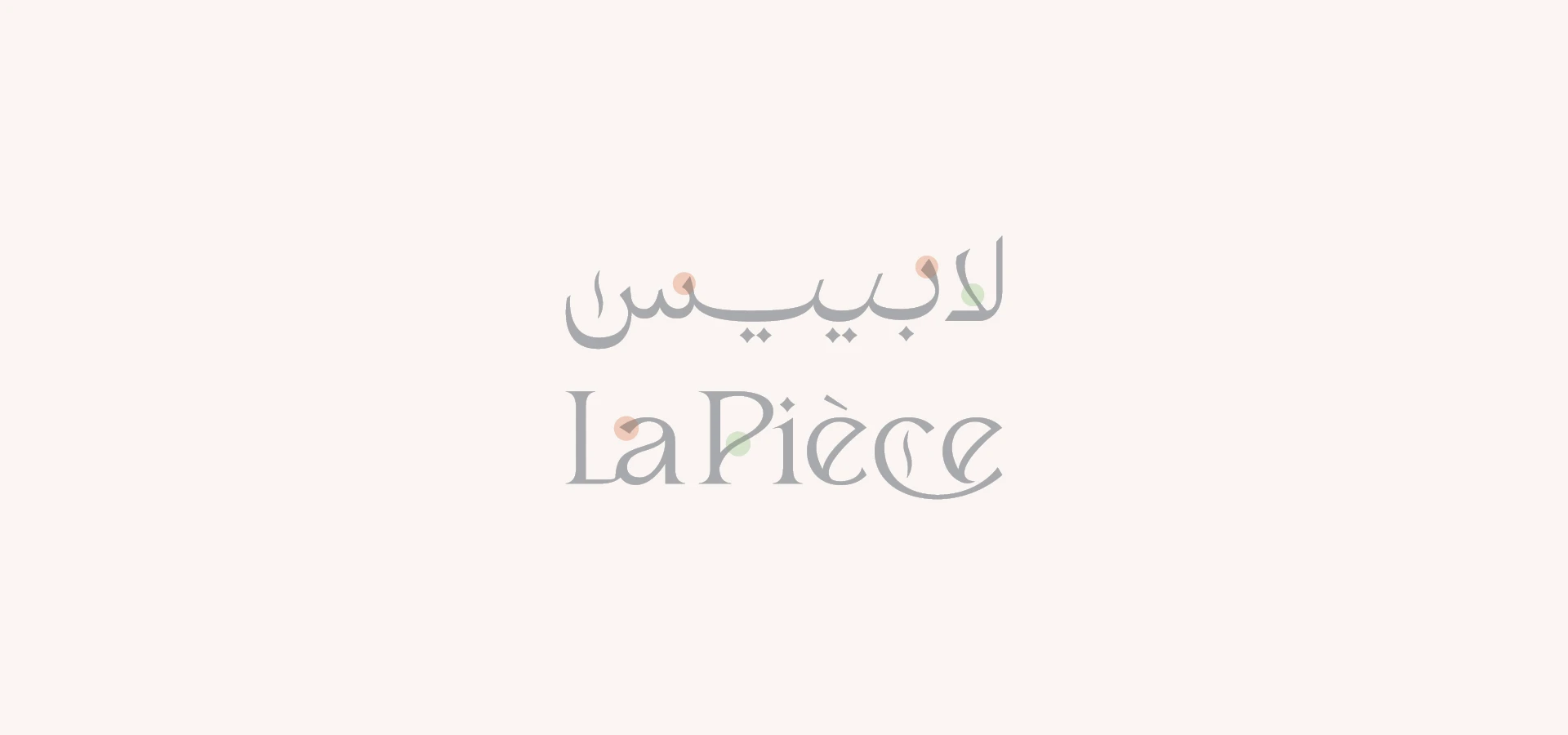
The font was created especially for the brand, and among the font’s indications are contrast and fluidity, and what was focused on is the ease of reading it, and from a technical point of view, the pairing between the name written in Arabic letters and Latin letters was made proportionally and with the same thicknesses, and there is a clear and direct connection between them
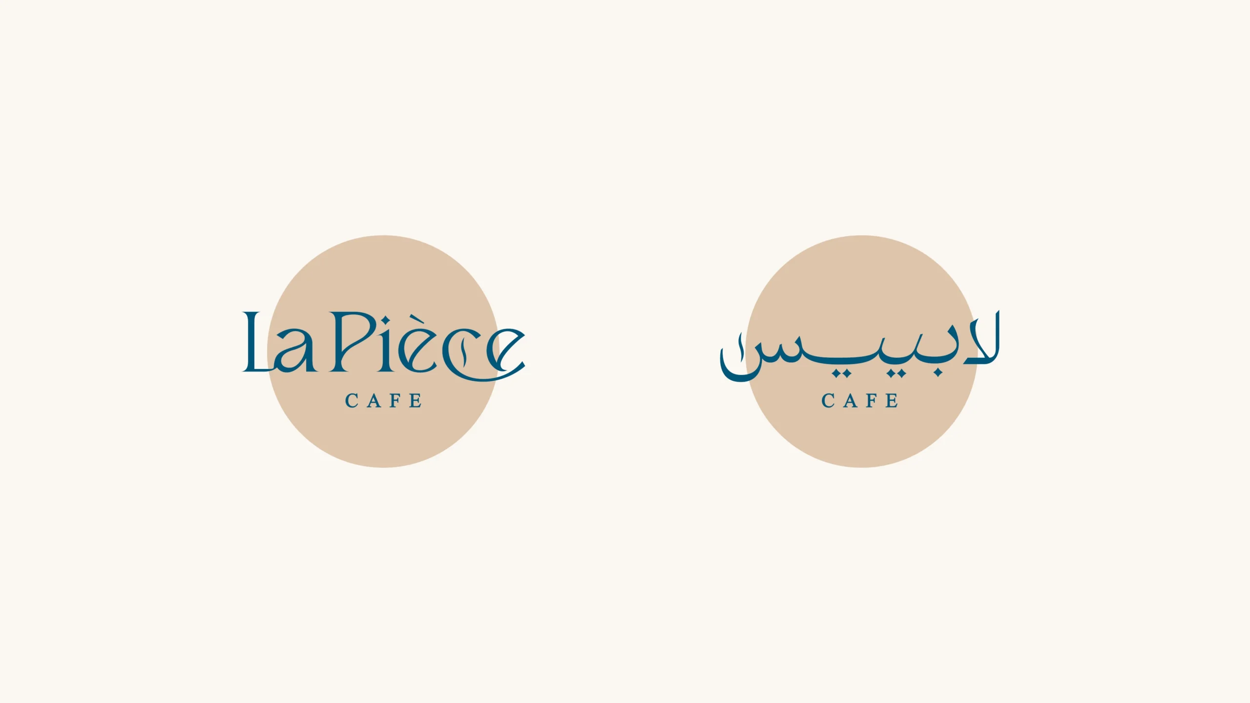
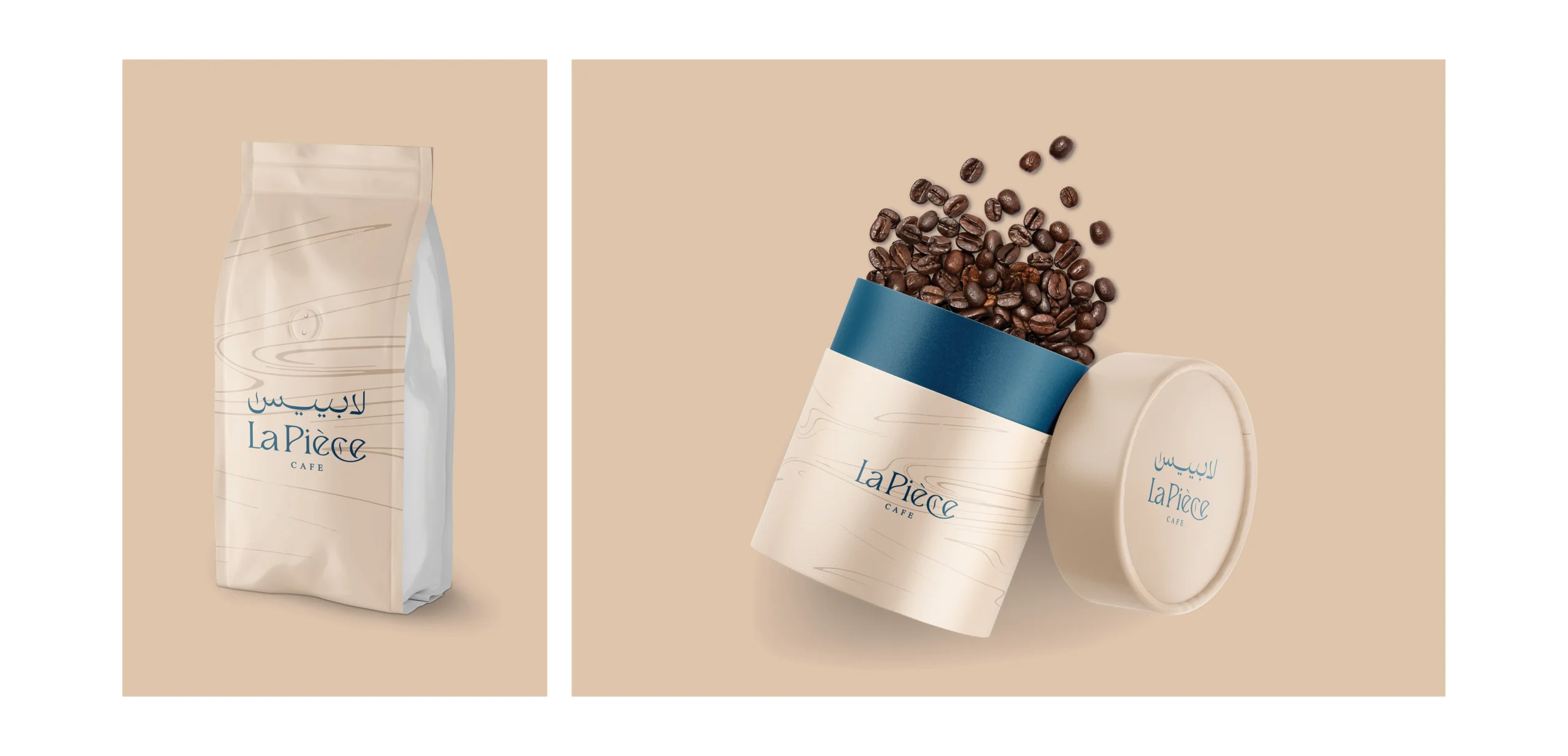
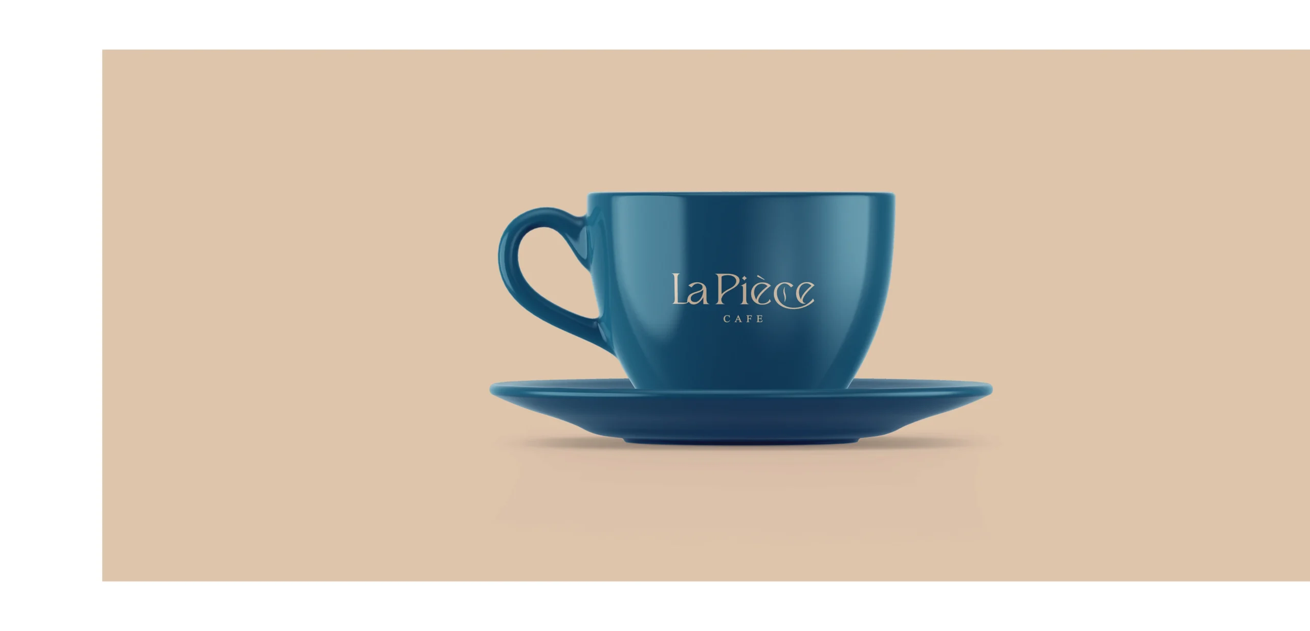
The colors were chosen to be appropriate with the meaning of the name as well as the interior design of the brand, namely: golden, which is derived from the colors of coffee drinks such as Nescafe, Latte, and other golden-colored drinks, as well as the color of the interior design of the brand, which is based on the overlap of shades of golden and blue, which is one of the colors that has a classic character Luxurious and easy on the eye, it has an excellent contrast with the golden hue